Visualizing Data
Here we will go over visualizing your data with maps. feedr includesa wrapper function that can be used to visualize your data on maps. This function, map_leaflet is really just a convenience function to do a lot of the grunt work. If you want to achieve a more fine tuned map, I suggest you check out the packages leaflet or mapview.
map_leaflet takes summarized presence and movement data and turns it into circles and paths around/between loggers representing time spent at different loggers and the amount of movement between particular logger paths. Because different projects may need different summaries (totals vs. means, corrected for number of individuals, uncorrected, etc.) we will first go over how to create the summary data and then pass this to the functions for plotting. This gives us more flexibility, but does mean that we have to do some work before we can visualize the data.
The companion package, feedrUI, also includes a stand-alone shiny app (launched with ui_animate()) that can be used to create simple animations of your data, this is a simple process as it does not require summarized data, but is also less flexible (see animations below).
Built-in Summaries
Let’s start by calculating presence and movements:
v <- visits(finches_lg)
p <- presence(v)
m <- move(v)
There are many ways we can summarize the data. The following options are available through the summary argument of the mapping functions:
- by individual
- totals (sums)
- totals corrected for number of individuals
map_leaflet()
This function creates an interactive html map using leaflet for R (package leaflet).
map_leaflet(p = p, m = m, summary = "sum_indiv")The map is interactive in that it can be zoomed, the tiles changed, and different elements added or removed. loggers (white-outlined black dots) can also be clicked on to reveal ids and circles and paths can clicked on to reveal their actual numbers.
You can also adjust some of the cosmetic details:
map_leaflet(p = p, m = m, summary = "sum_indiv",
            p_scale = 0.5, m_scale = 0.5,
            p_title = "Presence (min)", m_title = "Paths (Total use)",
            p_pal = c("blue","white"), m_pal = c("black","red"))
To plot by individual, simply use individual summaries:
map_leaflet(p = p, m = m, summary = "indiv")Note, however, that for leaflet maps, the individual lines are stacked in order of magnitude and visualizations like this may not be very useful for large numbers of individuals.
To save this map, you can zoom and set it up as you like and use the “Export > Save as image” button in RStudio.
| Back to top |
Custom Summaries
Calculate total time present at each logger, corrected for the number of individuals total
p_pop <- p %>%
  group_by(logger_id) %>%
  summarize(amount = sum(length) / animal_n[1])
p_pop
## # A tibble: 4 × 2
## logger_id amount
## <fct> <dbl>
## 1 2100 159.
## 2 2200 37.2
## 3 2400 0.185
## 4 2700 174.We use animal_n[1] because we want to divide the total sum by the number of individuals in each experiment. However, the value animal_n is repeated, but we only need the first one, hence the [1].
If we wanted to calculate mean time present, we would use amount = mean(length)
If we wanted to calculate total time presence with no correction, we would use amount = sum(length)
Note: The new summary data set must have the column amount, regardless of how it is calculated. The mapping functions will look for that column name.
Now let’s summarize the movement data for each movement path between loggers. We can summarize individually for each logger, which will account for the double counting (one row for leaving the logger and one row for arriving) as well as making sure we have logger_id in the final data set. We will also group by lat and lon, so they remain in the data set (because they are associated with logger_id they do not contribute any unique grouping combinations).
m_pop <- m %>%
  group_by(logger_id, move_path, lat, lon) %>%
  summarize(path_use = length(move_path) / animal_n[1])
## `summarise()` has grouped output by 'logger_id', 'move_path', 'lat'. You can override using the `.groups` argument.m_pop## # A tibble: 10 × 5
## # Groups: logger_id, move_path, lat [10]
## logger_id move_path lat lon path_use
## <fct> <fct> <dbl> <dbl> <dbl>
## 1 2100 2100_2200 50.7 -120. 1.09
## 2 2100 2100_2400 50.7 -120. 0.0909
## 3 2100 2100_2700 50.7 -120. 14.5
## 4 2200 2100_2200 50.7 -120. 1.09
## 5 2200 2200_2700 50.7 -120. 1.36
## 6 2400 2100_2400 50.7 -120. 0.0909
## 7 2400 2400_2700 50.7 -120. 0.0909
## 8 2700 2100_2700 50.7 -120. 14.5
## 9 2700 2200_2700 50.7 -120. 1.36
## 10 2700 2400_2700 50.7 -120. 0.0909Note: The new summary data set must have the column path_use, regardless of how it is calculated. The mapping functions will look for that column name.
Specify summary = none when the data is already summarized:
map_leaflet(p = p_pop, m = m_pop, summary = "none")We can also summarize data by individual for plotting of individual maps.
This is virtually identical to what we did above, except that we add one more variable to group by and we don’t correct for the number of individuals:
p_indiv <- p %>%
  group_by(animal_id, logger_id) %>%
  summarize(amount = sum(length))
## `summarise()` has grouped output by 'animal_id'. You can override using the `.groups` argument.p_indiv## # A tibble: 23 × 3
## # Groups: animal_id [11]
## animal_id logger_id amount
## <fct> <fct> <dbl>
## 1 041868E9A8 2100 2.02
## 2 041868E9A8 2200 190.
## 3 041868E9A8 2700 14.5
## 4 041869123C 2200 23.8
## 5 06200003AA 2100 23.2
## 6 06200003AA 2700 312.
## 7 0620000400 2100 7.77
## 8 0620000400 2700 24.8
## 9 062000043E 2700 0.0333
## 10 0620000477 2100 14.4
## # … with 13 more rowsm_indiv <- m %>%
group_by(animal_id, move_path, logger_id, lat, lon) %>%
summarize(path_use = length(move_path))## `summarise()` has grouped output by 'animal_id', 'move_path', 'logger_id', 'lat'. You can override using the `.groups` argument.m_indiv## # A tibble: 32 × 6
## # Groups: animal_id, move_path, logger_id, lat [32]
## animal_id move_path logger_id lat lon path_use
## <fct> <fct> <fct> <dbl> <dbl> <int>
## 1 041868E9A8 2100_2700 2100 50.7 -120. 1
## 2 041868E9A8 2100_2700 2700 50.7 -120. 1
## 3 041868E9A8 2200_2700 2200 50.7 -120. 3
## 4 041868E9A8 2200_2700 2700 50.7 -120. 3
## 5 06200003AA 2100_2700 2100 50.7 -120. 6
## 6 06200003AA 2100_2700 2700 50.7 -120. 6
## 7 0620000400 2100_2700 2100 50.7 -120. 3
## 8 0620000400 2100_2700 2700 50.7 -120. 3
## 9 0620000477 2100_2700 2100 50.7 -120. 8
## 10 0620000477 2100_2700 2700 50.7 -120. 8
## # … with 22 more rowsRecap:
To create maps you need to define a summary OR create custom summaries with the following:
- presence summary with a columns:
logger_idandamount - movement summary with a columns:
logger_id,move_path,path_use,lat, andlon
If you want to look at individual data, add animal_id to the groupings.
Animations
To look at animations of your data overtime, you can use the function ui_animate() to launch the animation shiny app included in the feedr package:
library(feedrUI)

ui_animate(v)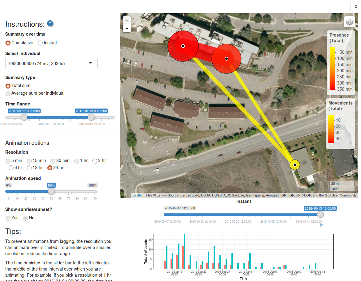
Here you can choose
- Whether animations should show cumulative or instantaneous movements/path use
- Which individual (or all individuals) to animate over
- What kind of summary to show (total sum, or, if average sum, if all individuals are chosen)
- What time range
- The temporal resolution of each animated frame (i.e. the time frame that data will be summarized over)
- The animation speed (how fast will frames advance?)
- Whether to include a shadowed overlay showing sunrise and sunset
The figure along the bottom shows the number of movements and/or bouts of presence over time. This can help you chose which time frames to include.
Back to top
Go back to home | Go back to transformations